Weekly photo challenge: Harmony
In response to the Daily Post’s Weekly Photo Challenge: Harmony.

You may detect an element of irony :)
In response to the Daily Post’s Weekly Photo Challenge: Harmony.
You may detect an element of irony :)

The typeface, that is, not the place. Apple designed a new font for their watch, aimed at being legible on small, high-resolution displays. They later brought it to iOS and OS X, providing consistency across all their devices. Nick Keppol has written a two-part article that explains typography basics and then takes us through the design decisions that went into creating the new typeface. It's fascinating for a typography nerd like me. Feast your eyes and brain here.
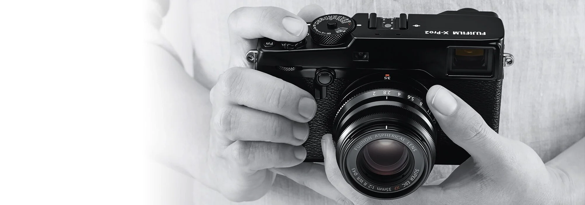
Fujifilm have announced their new 'Pro' camera, and it looks pretty fantastic. I have loved the Fujifilm dedication to their own vision of what a camera should be - small and light, but with high quality design and manufacturing that combines wonderfully "traditional" style handling (i.e. good ergonomics and manual controls instead of lots of menus) with some ground-breaking technology. Not only do their cameras take good photos, but the experience of using them is very natural and harks back to the classic 35mm film cameras that we remember fondly.I've started up an X-Pro 2 resource page, which I will continue to update as I discover more.