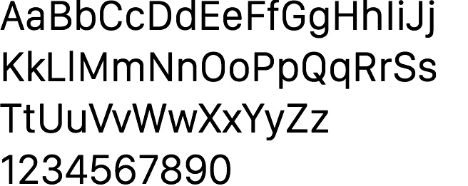
The road to San Francisco
The typeface, that is, not the place. Apple designed a new font for their watch, aimed at being legible on small, high-resolution displays. They later brought it to iOS and OS X, providing consistency across all their devices. Nick Keppol has written a two-part article that explains typography basics and then takes us through the design decisions that went into creating the new typeface. It's fascinating for a typography nerd like me. Feast your eyes and brain here.